- May 13, 2022
Are we there yet?
As the market route continues from April into May, we’re often asked whether we feel the bottom is near… only for that question to be answered quite quickly with fresh lows being set! In this newsletter we take a step back and look at some high-level fundamentals.
Market falls
To put it in context, as of 12th May the year to date market declines look like this:
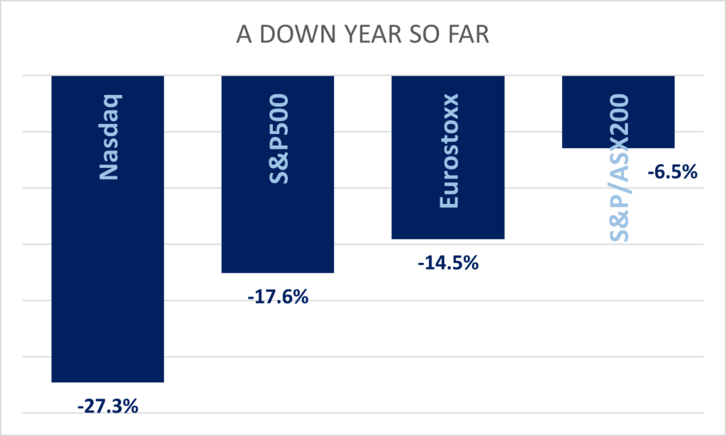
Clearly the higher materials and energy weightings in the Australian market are significantly pulling their weight. Sector heavyweights Materials and Financials are close to flat for the year, with Energy up 26%, As these sectors account for over 50% of the local market, it’s hardly surprising the ASX200 is outperforming… just don’t ask about Tech or Consumer Discretionary exposures.
These sector returns are broadly similar with markets everywhere else, it’s just that they account for significantly more of the local Index exposure than in other regions. As usual, getting the sector, or the factor right, will usually far outweigh the contribution to returns from individual stock selection. Commodities and Value were clearly the boats to be in so far this year.
Valuations
So where are we now in terms of valuations? The chart below plots the forward Price/Earnings (P/E) ratio for Australia, the US and Europe. This provides a simplistic measure of where share prices are at, relative to the earnings they are expected to generate in the coming year.
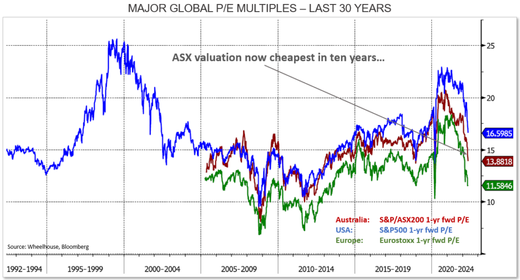
On a pure valuation basis, and relative to history, equity markets look fairly priced. Perhaps even attractively priced at this point given the expected returns from many other asset classes are likely to be challenged.
This may provide some comfort that whether the bottom of this market correction is at hand or not, at least we’d be owning equities at a relatively attractive price.
Earnings
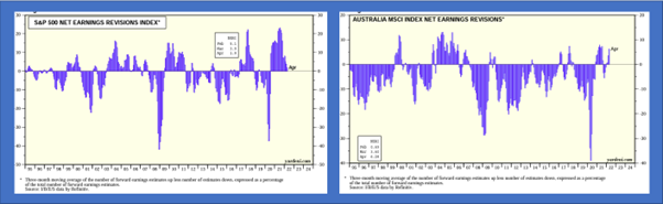
The other side of the P/E multiple is obviously earnings. According to Yardeni research, earnings thus far have remained relatively robust, with no downgrades to speak of in the US yet, and Australia even posting recent earnings upgrades on stronger commodity prices.
However, as always it’s the outlook that matters. The chart below aggregates verbal cues from the most recent reporting season in the US. The chart tallies when management refer to ‘weaker’ demand, or ‘lower’, ‘softer’ or ‘moderating’, to give an indication of managements expectations as communicated in their most recent earnings commentaries.
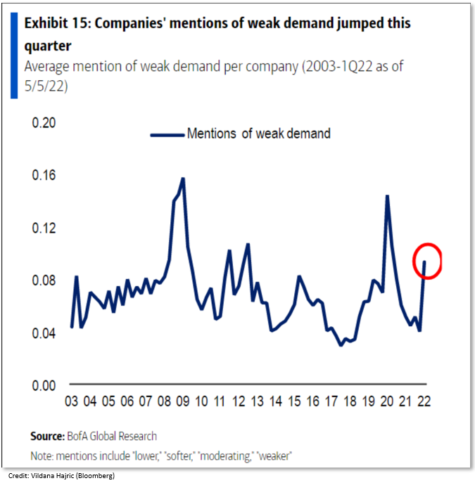
Should earnings decline on weaker demand, then the attractive P/E multiples currently screening above may prove a little illusory. If so, then the 14x multiple for the Australian market may be more likely 15 or 16x.. depending upon how bearish you expect earnings to be.
So, are we there yet?
As always in investing, it is usually only in hindsight that opportunities (and risks) become more obvious. Clearly there are risks with the current economic outlook and the ability of companies to grow earnings as expected, as there always is. While valuations are clearly pricing in a reasonable amount of gloom, it does seem more likely that an economic slowdown in the US and Australia, perhaps even a recession, is closer than it seemed even at the beginning of the year.
The inflation genie, and how quickly it recedes, is looking like playing a pivotal role in future expected returns. This makes it very difficult to provide a definitive answer.
We believe there is a way to avoid having to be proven right, or wrong, on calling the bottom. When income forms the lions share of the investment return, the outcome is far less dependent upon whether the market is at its lows, or whether there is further to fall. This is more relevant for our Global strategy, which is lower risk, but the double dividends of the Australian strategy should serve it well should markets go sideways from here.
So perhaps not a black and white answer to the question of ‘is this the bottom’, but at the same time it is a solution for investors who are aware that they need to take risk in order to generate acceptable returns, but also recognise they are uncertain what happens next with markets.
With high income generation contributing a large component of our investment returns, we believe both strategies should do well regardless of the shorter-term market movements that lie ahead of us.
Wheelhouse Global Equity Income Fund
7.9%
Income over 3 years (p.a.)
4.7%
Total return 3 years (p.a.)
| 1 month | 1 year | 3 years (p.a.) | Since inception^ | |
| Income | 0.00% | 7.88% | 7.86% | 7.36% |
| Growth | 1.00% | (6.49%) | (3.20%) | (1.01%) |
| Total Return | 1.00% | 1.39% | 4.66% | 6.35% |
| Benchmark* | (3.17%) | 4.73% | 10.07% | 10.94% |
| Risk (Beta)** | n/a | 0.54 | 0.44 | 0.60 |
Performance figures are net of fees and expenses.
* Benchmark is the MSCI World Index (ex-Australia).
**Risk is defined as Beta and sourced from Morningstar Direct. A Beta of 1.00 represents equivalent market risk to the Benchmark. A minimum of 12 months data is required for the calculation.
^ Inception date is 26/05/2017. Since inception figures are calculated on a p.a. basis. Past performance is not an indicator of future performance.
Global fund commentary
During the month Global sharemarkets fell quite aggressively, with the Benchmark declining 8.4% in USD. On an equivalent basis (in USD) the Fund fell 4.4%, or a little over 53% downside capture. This is consistent with our risk targeting during drawdowns. With the Australan dollar resuming it’s defensive characteristics (refer February report for historical analysis of the AUD) the Fund was able to deliver a slight positive return to Australian investors for the month. This trade-off of around half the underlying risk (in USD) and an unhedged exposure (in AUD) has consistently achieved positive returns for Australian investors during most market drawdowns.
Click here to read the full performance report of the Wheelhouse Global Equity Income Fund.
Wheelhouse Australian Enhanced Income Fund
10.1%
Income since inception (p.a.)
14.7%
Total return since inception (p.a.)
| 1 month | 3 months | 12 months | Since inception^ | |
| Income* | 0.03% | 3.83% | 11.19% | 10.08% |
| Growth | (1.23%) | 6.37% | 1.36% | 4.65% |
| Total Return | (1.20%) | 10.20% | 12.55% | 14.74% |
| Benchmark** | (0.85%) | 8.84% | 11.74% | 13.93% |
| Excess return | (0.35%) | 1.35% | 0.81% | 0.81% |
Performance figures are net of fees and expenses. Since inception numbers include 30bps exit spread.
* Income includes cash distributions and the value of franking credits and special dividends. Cash distributions are paid quarterly.
** Benchmark is the S&P/ASX 200 Franking Credit Adjusted Daily Total Return Index (Tax-Exempt).
^ Inception date is 9/03/2021. Since inception figures are calculated on a p.a. basis. Past performance is not an indicator of future performance.
Click here to read the full performance report of the Wheelhouse Australian Enhanced Income Fund.
News
Zenith issues 'Recommended' rating on Wheelhouse Australian Fund

We are pleased to report that research house Zenith has issued a ‘Recommended’ rating on the Wheelhouse Australian Enhanced Income Fund after only 12 months of Fund performance.
In their report, Zenith notes that “Wheelhouse’s investment approach is differentiated and appealing for nil/low taxpaying investors who are income focused”. “Given the Fund’s return profile, Zenith is comfortable for it to be held as a core Australian equities exposure for income focused investors”
The report adds,” Overall, Zenith believes the Wheelhouse team has a wealth of experience relating to the options market and risk management, which ensures that the Fund’s risk management processes are strong”.
Please contact us for a copy of the Zenith report on the Wheelhouse Australian Enhanced Income Fund.
Article
Zenith issues 'Recommended' rating on Wheelhouse Australian Fund
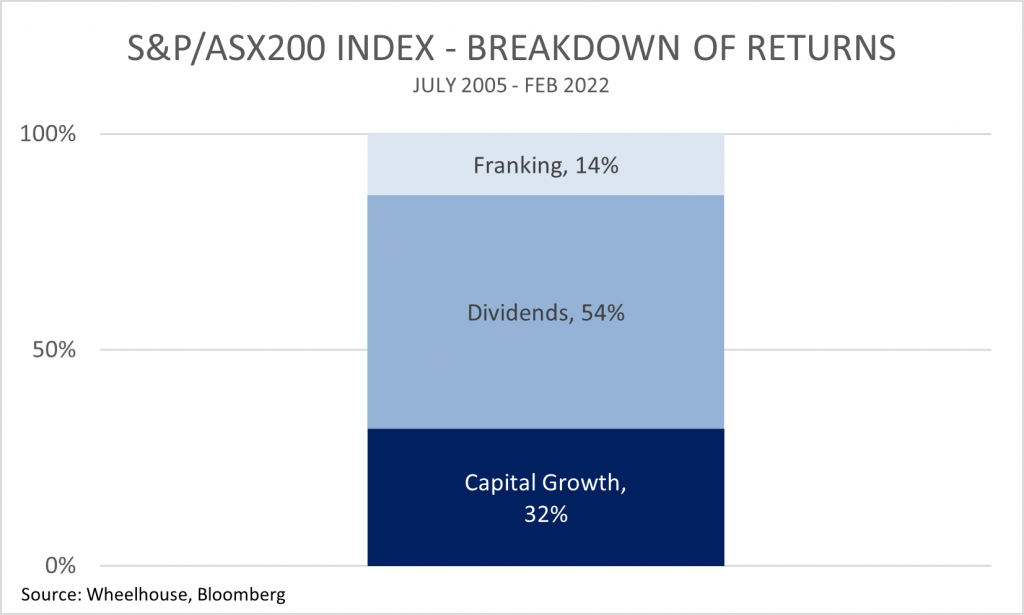
It’s no secret that Australian investors love their dividends. But recent Morningstar research has found that a portfolio of higher dividend-paying shares actually meaningfully outperforms over the long term.
But by how much, you ask? Great question.
Over a 45 year period, the research house found that Aussie dividend payers beat the S&P/ASX 200 benchmark by 3.7%, on average, every single year, delivering investors a return of 14.8% per annum.
Unfortunately, getting the right exposure to these Aussie high yielders isn’t as easy as one may think. We reviewed the performance of the largest six “dividend” or “high yield” ETFs available locally, and all but one have underperformed the S&P/ASX 200.
In this article, we outline a probable cause for this underperformance, as well as why an alternative strategy to target dividends may be investors’ best approach to taking advantage of this long-term opportunity.
Please click here to view the full article on Livewire or message us for a copy of the Morningstar Dividend report referenced.
Article
Ready to eat dividends?
Australian equities are likely to underperform the world market over the next five years, according to the Blackrock Investment Institute. Local market returns are expected to average 4.5% over these years, compared with 6% for US markets, and 9% for Europe.
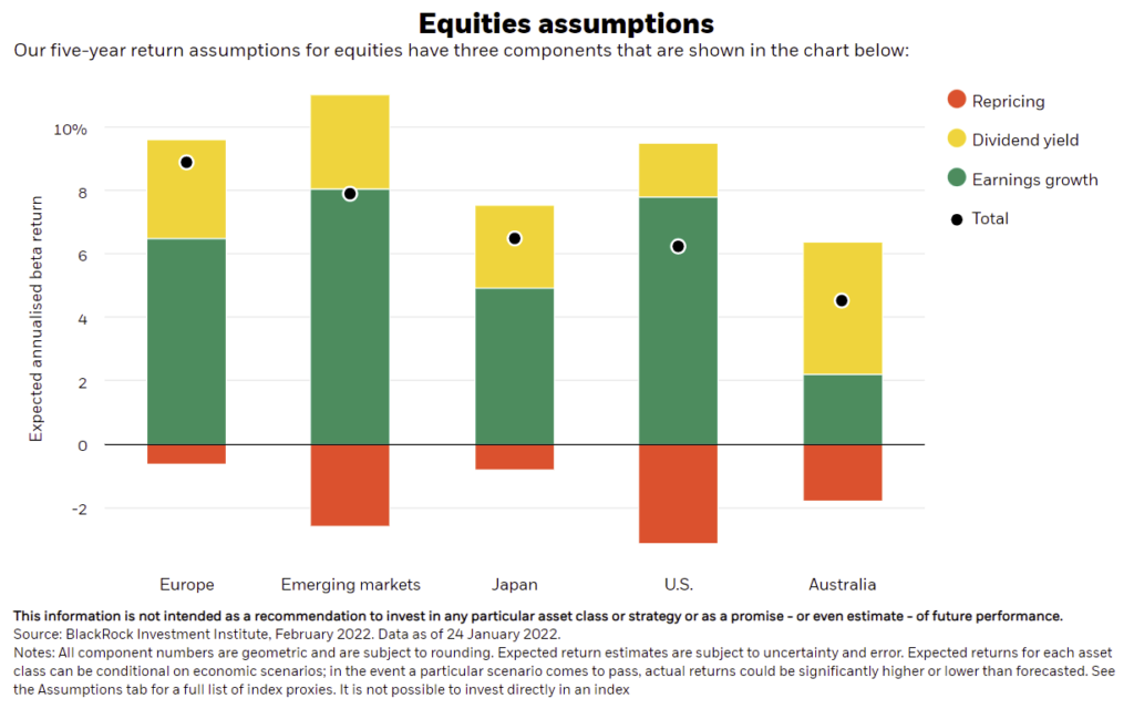
If these forecasts are accurate, the reality for many Australian investors is that dividends will make up nearly 100% of expected total returns from equities over this period. Capital growth would likely prove negligible, as the positive effects from earnings growth are largely offset by falling valuations (as rates rise, valuations typically fall).
Please click here to view the full article on Livewire