- November 10, 2021
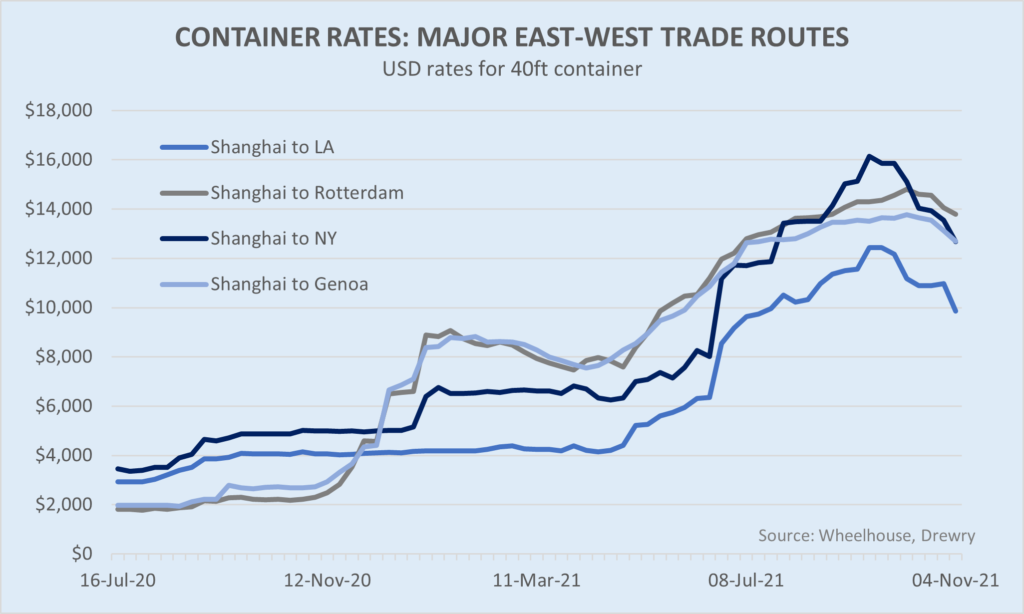
Peak shipping?
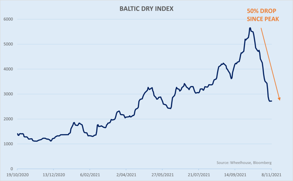
The trend is similar for the Baltic Dry Index (bulk shipping, eg grains and metals), plus a number of other commodity prices which look to have peaked in the last few weeks.
Should freight rates continue to moderate, Central Banks globally may rightly feel vindicated in their views that inflation was indeed temporal, or transitory, or at least short term in nature. To be sure, inflation may well still print higher for many months as these higher shipping costs are passed onto consumers – but with a moderation in freight costs, one of the root causes of higher inflation may have already peaked.
In turn, this should be supportive for markets, as the risk of policy error subsides and an accommodative monetary environment may persist for longer.
While the market breathes a sigh of relief (what we seem to be observing this past week) and reduces the risk of a stagflation-type environment (interest rates pushed higher to head off inflation, despite soft labour market), we would caveat that this may only be a temporary reprieve from a generally tightening cycle.
Interest rates are still likely to go up given their low absolute levels, plus we’re still technically in an ‘emergency stimulus’ period post covid. However, it may simply be that the pace of rate hikes proves a little less aggressive than what was expected a month or two back. This subtle change may be all that is required to spark a little relief rally into year end.
Lower growth ahead
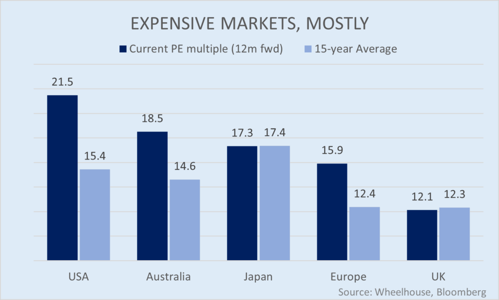
Longer-term however, the elephant in the room remains sky-high valuations across all asset classes. Within equities for example, the US, Australian and European markets are currently trading 30-40% above their 15-year averages (from a forward PE multiple perspective). This presents major headwinds for further capital appreciation across all asset classes.
This viewpoint is reflected in the latest 10-year expected returns from Morgan Stanley, which shows slower growth expected ahead, particularly for US equities and Fixed Income. While Australia is not separately broken out in the chart below, other institutional estimates are looking for 4.5% nominal growth for Australian equities over this period, or around 3.8% real after inflation and franking credits are included.
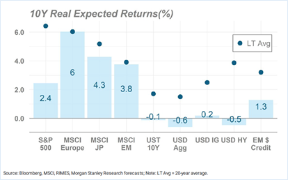
Clearly lower growth in anyone’s language, but especially relative to the massive gains enjoyed the last few years.
Income as a source of real return
Faced with lower expected returns from asset growth, we believe income is likely to be a far more meaningful contributor to investor returns than it has been the previous 10 years.
Other studies have highlighted this from a dividend perspective, where in lower growth decades (for eg the 1940s, 1950s and 1970s), returns from dividends contributed over 60% of total shareholder return. In the most recent decade this fell to only 17%, due in part to much stronger capital appreciation (which diluted the contribution from dividend income), plus less generous payout policies from companies.
Since the introduction of systematic income producing overlays on the S&P 500 in the 1980’s, the same income generating characteristic has also proven reliable in delivering real returns, even when markets failed to deliver capital growth. Should we be entering a genuine lower growth period, income may well prove once again a valuable source of real return, with far less reliance on shares having to go up.
Post Script
As the valuation chart above illustrates, one of the few markets trading at a discount to history, at least slightly, is the FTSE 100 Index in the UK. Couple of points on this:
- The UK market (the FTSE) has underperformed global equity markets for 6 straight years now. The current dividend yield is 4.0%, more than 3x the US.
- The composition of the FTSE is a value investors playground. Technology accounts for only 1% of the index, versus 5% in Australia and 28% in the US. The largest sectors include Energy, Materials, Consumer Staples, Healthcare (Pharma) and Financials. All of these are generally shorter duration and typically well disposed, at least relatively, to a tightening monetary cycle.
- Even excluding the typically lower multiple Energy and Financial sectors, the UK is still trading at the largest discount to Global equity markets for many years.
- While Brexit is a concern for the UK economy and the GBP, the FTSE is a genuinely Global market, with around 70% of revenues generated outside the UK. While the pound may rise and fall on Brexit developments, typically the value of the Index will rebase depending upon the foreign currency earnings. This explains why the FTSE often increases when the GBP falls.
Wheelhouse Global Equity Income Fund
7.9%
Income over 3 years (p.a.)
7.9%
Income over 3 years (p.a.)
| 1 month | 1 year | 3 years (p.a.) | Since inception^ | |
| Income | 0.00% | 8.77% | 7.88% | 7.46% |
| Growth | (1.89%) | (1.78%) | 0.01% | 0.50% |
| Total Return | 1.89% | 10.54% | 7.90% | 7.95% |
| Benchmark* | 1.65% | 31.36% | 16.05% | 13.94% |
| Risk (Beta)** | n/a | 0.62 | 0.44 | 0.59 |
Performance figures are net of fees and expenses.
* Benchmark is the MSCI World Index (ex-Australia).
** Risk is defined as Beta and sourced from Morningstar Direct. Beta is represented vs the Benchmark and vs the S&P/ASX 200 Index. A Beta of 1.00 represents equivalent market risk to the comparison Index. A minimum of 12 months data is required for the calculation.
^ Inception date is 26/05/2017. Since inception figures are calculated on a p.a. basis. Past performance is not an indicator of future performance.
Performance comment
While income generation and risk have been on target, performance for the past 12 months has been less than our targeted objective of roughly 55% capture in strong markets. We expect to underperform in higher growth environments (and outperform in lower growth and negative markets), but we felt this greater deviation was worth some explanation.
The reason for the less than target return has been the 5.4% underperformance of the Morningstar Index during the past year, which our equity exposures reflect. Most of this ‘negative alpha’ is reflected in our returns and has caused the deviation from target capture.
We constantly monitor returns of the Morningstar Index, which over the past ten years has delivered over 3% in annual outperformance (which we seek to capture). Most of the recent underperformance has been due to an overweight to large Healthcare names during the year (Roche, AstraZeneca et al), which trailed the market.
The current Healthcare exposure is now more consistent with the longer-term history of the Index, and we see no reason why the underperformance will continue (November returns to date have already seen some evidence of this).
Click here to read the full performance report of the Wheelhouse Global Equity Income Fund.
Wheelhouse Australian Enhanced Income Fund
Performance numbers below are based on exit prices and include the 30bps exit spread. The fund has passed the six-month hurdle and is outperforming as expected, with a very low tracking error of 0.65 for this period.
| 1 month | 3 months | 6 months | Since inception^ | |
| Income* | 0.01% | 2.14% | 6.01% | 6.28% |
| Growth | (0.23%) | (0.13%) | 2.39% | 6.40% |
| Total Return | (0.22%) | 2.01% | 8.40% | 12.68% |
| Benchmark** | (0.09%) | 1.07% | 7.11% | 11.24% |
| Excess return | (0.13%) | 0.94% | 1.29% | 1.44% |
Performance figures are net of fees and expenses.
* Income includes cash distributions and the value of franking credits and special dividends. Cash distributions are paid quarterly.
** Benchmark is the S&P/ASX 200 Franking Credit Adjusted Daily Total Return Index (Tax-Exempt).
^ Inception date is 9/03/2021. Since inception figures are calculated on a p.a. basis. Past performance is not an indicator of future performance.
Click here to read the full performance report of the Wheelhouse Australian Enhanced Income Fund.