- December 19, 2023
Volatility crush: Complacency or simply Confidence?
Equity market volatility everywhere has been crushed. Whether we look at the VIX Index in the US or the equivalent volatility Index for the S&P/ASX200 Index, these ‘Fear Index’ gauges are telling the same story… there appears very little to fear at present.
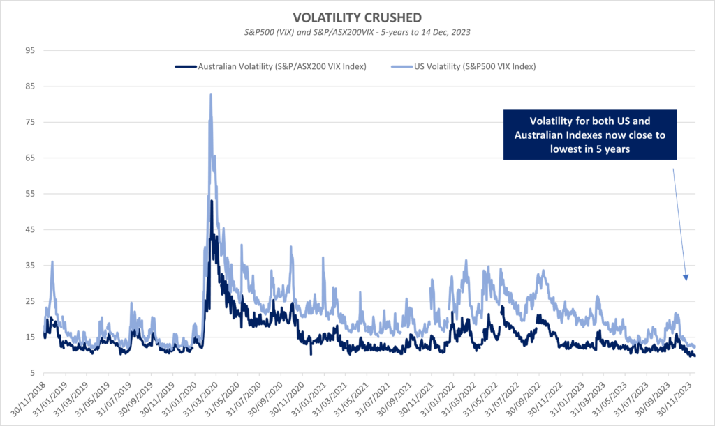
The very low readings may seem a little inconsistent with the current market outlook, with a recession potentially imminent, higher interest rates versus recent history, elevated geopolitical risk, and increasing concerns about the fiscal position of the US Government.
Does this apparent disconnect suggest the market is overly complacent, or perhaps these risks and concerns are simply unfounded?
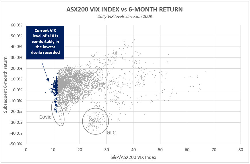
To assess this we’ve run some analysis on historical 6 month forward returns of the S&P/ASX200 Index, relative to the starting volatility print. In the chart below, the x-axis plots the closing level of S&P/ASX200 VIX Index, with the y-axis plotting the subsequent 6-month historical total return of the S&P/ASX200 Index.
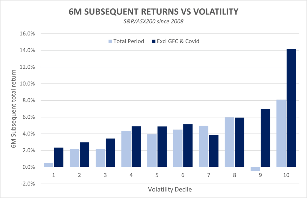
The same data can also be broken down into average returns by volatility decile, as the chart below illustrates. In this analysis we have also presented returns without the two major black-swan type events that have dominated the negative returns above.
Some observations of this dataset:
In general, the data shows that the lower the starting volatility, the lower the subsequent 6-month return. This makes intuitive sense as historically it can be said that the best returns are likely made when fear is at its highest. This relationship seems particularly strong when volatility is in the top deciles, although beware a systemic crisis like the GFC.
On a positive note, absent a GFC event, average 6-month returns across all volatility deciles was positive. These are equities after all, and for investors who stayed invested over the journey, historically it is shown that they usually go up.
One other aspect to note from the scatterplot is the sheer range of outcomes. While average returns have been almost always comfortably positive, there are clearly some ups and downs along the way. However, it does appear that the range of outcomes when volatility is in the lowest decile has been more muted than when volatility is closer to average.
Conclusion - Complacency or simply confidence?
At least historically, lower volatility has tended to result in lower subsequent returns… although we aren’t planning on moving to cash and buying baked beans just yet. Average returns across the volatility spectrum have historically been mostly positive and market timing is notoriously difficult to get right.
Furthermore, it does appear that absent a black-swan type event like Covid or the GFC, volatility in the lowest decile has historically resulted in a narrower range of outcomes. This may suggest that perhaps when volatility is this low, the market has historically been relatively correct in its assessment that few nasty surprises are imminently lurking, or at least that the risks that are present are well known and understood.
We believe there are other ways investors can exploit extremely low volatility, as opposed to making large asset allocation changes. Buying protection has rarely been cheaper, which we have been availing ourselves of across both of our funds. While income generation from selling options is generally lower in low volatility environments, the trade-off versus forgone capital gains is usually more favourable during these periods. (Our analysis suggests BuyWrite strategies work best in lower growth environments).
As we look forward to 2024, there could be many reasons why market volatility levels move higher to more average levels. Historically spikes in volatility are also accompanied by market falls, although we believe trying to time these periods remains a fools errand. In the meantime, we can simply enjoy the low volatility, prepare the portfolios for when this environment changes, and hopefully in the meantime reap the benefits from owning equities for the long term.
Catch up on Alastair’s latest article

Read more about “Compounding and taxes: a checklist for investors” in Al’s article on LiveWire.
Wheelhouse Global Fund
| 1 mo | 3 mo | 6 mo | 1 yr | 3 yrs (pa) | 5 yrs (pa) | S/I (pa) | |
| Total fund return | 3.2% | -2.1% | -1.7% | 0.6% | 3.7% | 5.5% | 5.9% |
| RBA+2.5%* | 0.6% | 1.7% | 3.4% | 6.5% | 4.2% | 3.9% | 3.9% |
| Risk (volatility) | – | – | – | 6.4% | 7.7% | 7.6% | 7.7% |
* The Fund’s benchmark is RBA +2.5% and is used for all time periods shown. From the Fund’s inception to 31 August 2023 the Fund’s benchmark was MSCI World ex Australia Index (AUD). The change in benchmark does not impact any fees the manager may earn and the Fund’s investment objective has not changed.
Performance figures are net of fees and expenses. Inception date is 26 May 2017. Past fund performance is not indicative of future performance.
Wheelhouse Australian Fund
| 1 mo | 3 mo | 6 mo | 1 yr | S/I pa^ | |
| Income* | 0.3% | 2.5% | 4.2% | 8.6% | 10.4% |
| Growth | 5.2% | -4.3% | -2.6% | -6.9% | -4.5% |
| Total Return | 5.5% | -1.8% | 1.6% | 1.7% | 5.9% |
| Benchmark** | 5.2% | -1.4% | 2.8% | 2.9% | 7.5% |
Performance figures are net of fees and expenses. Since inception numbers include 30bps exit spread.
* Income includes cash distributions and the value of franking credits and special dividends. Cash distributions are paid quarterly.
** Benchmark is the S&P/ASX 200 Franking Credit Adjusted Daily Total Return Index (Tax-Exempt).
^ Inception date is 09/03/2021. Since inception figures are calculated on a p.a. basis. Past performance is not an indicator of future performance.
For any questions or enquiries about our funds or investment strategies, please contact Wayne McGauley, Head of Distribution, via wayne.mcgauley@wheelhouse-