- April 19, 2023
What's worse than Recession?
Everyone is bearish. And this makes complete sense.
House prices have fallen, industrial production surveys are falling, loan standards are tightening. Bond markets, usually a better forecaster of macro conditions than equity markets, are also signalling concern with the well publicised yield curve inversion touching extreme levels last month.
All of this makes a very strong case for an economic slowdown, and as the logic goes, a market correction.
We agree with this logic, especially with the US market on elevated multiples. It would be very unusual to not have some meaningful valuation compression (alongside earnings downgrades) as investor confidence wanes into a recession. Hence the basis for a 10-20% pullback scenario, which many are calling for and is feeding into the bearish narrative.
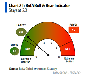
The bearishness is reflected in the most recent Bank of America ‘Bull and Bear Indicator’ which is close to extreme levels. As the indicators suggests, often when everyone is so bearish it can signal the market is a Buy!
While we’re not of that view yet, what’s intriguing about the current environment is that the equity market continues to disagree. Despite being one of the most well telegraphed recessions we’ve ever seen (Bloomberg reports 65% of economists are now forecasting a recession in the next 12 months), equity markets remain firmly positive for the year, with valuation multiples that imply growth prospects look appealing.
Battened hatches
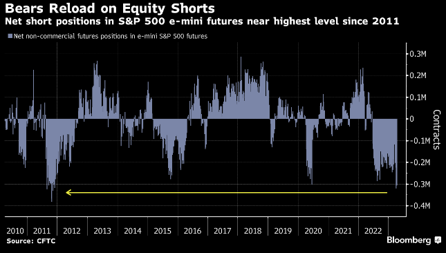
With such a strong consensus bearish view, it should come as no surprise that many investors are already very defensively positioned. Investor cash levels are reported by wealth management firms to be elevated and there are more net short futures positions on the S&P500 Index since 2011.
Despite all this negativity, we get the sense that many are waiting for a meaningful pullback to deploy capital back into the market. With interest rates near their peak, echoes of Buy-The-Dip and FOMO ring loud. Should everyone be reading from the same playbook then the expected market correction may well be shorter or shallower than many expect. This more optimistic scenario depends upon the US banking crisis continuing to abate and that no systemic credit event materialises.
A bigger risk than recession
We fear the focus on near term market corrections – whether it’s mild or material – may be masking a far more damaging risk for investors… an extended period of low growth, or even no growth in real terms.
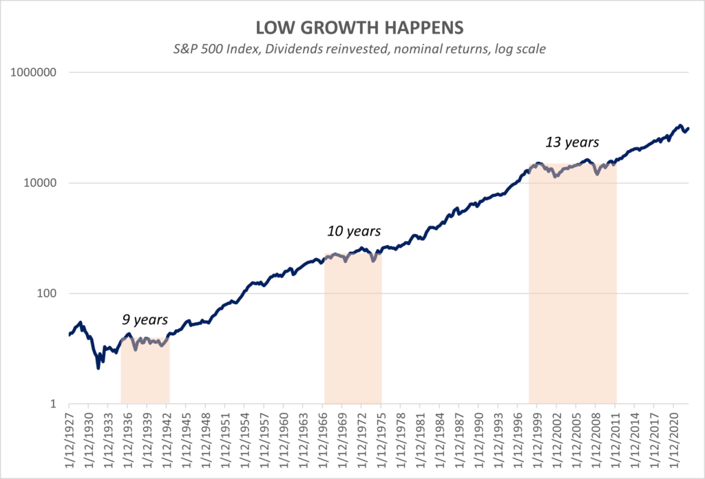
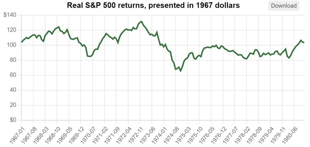
A closer look at the 1967 – 1980 period in real terms highlights an extremely challenging environment for investors to simply preserve their capital base, let alone considering the need to fund living expenses.
Markets effectively range-traded sideways in real terms for more than a decade, with corrections and recoveries, but with not much to show at the end of the period. It’s difficult to imagine the damage this period wrought to many investor’s outcomes.
A plug for income-driven real return strategies
It makes sense that in a market where capital growth fails to deliver, strategies that rely more on alternative sources of return, such as alternative income, should be far better placed in terms of delivering real investment returns.
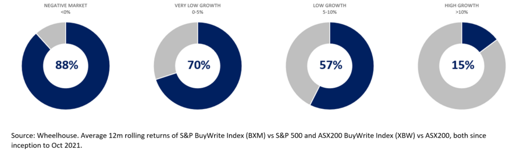
Our analysis of returns from systematic overlays on both the S&P500 and ASX200 are represented below. The entire principle of a BuyWrite overlay is based on the concept of receiving income today, in lieu of potential capital growth in the future. Should capital growth fail to materialise, investors are already well on their way to generating an acceptable real return.
Due to income (received option premium) providing the bulk of investment return, systematic BuyWrite strategies have typically outperformed in negative or low growth markets and trailed in double-digit return markets.
This concept of alternative income generation replacing the requirement for capital growth, underpins all of our investment strategies.
As a simplistic example, the income received from selling a 1-year S&P 500 option amounts to a 10% income return at current pricing. This income is received upfront, in exchange for assuming market risk for 12 months. Should market returns be closer to flat over this period, then an equity-like return is received without shares having to go up.
Should we enter a period of extended low returns of capital growth, the returns from alternative income (in lieu of capital growth) may help meet investors’ needs and avoid a 1970’s growth hangover. The time feels right to broaden and diversify sources of future returns.
Wheelhouse Global Equity Income Fund
8.1%
Income over 5 years (p.a.)
7.1%
Total return 5 years (p.a.)
| 1 month | 1 year | 3 year p.a. | 5 years p.a. | Since inception^ | |
| Income | 1.9% | 8.4% | 8.0% | 8.1% | 7.6% |
| Growth | (0.5%) | 0.9% | (3.3%) | (1.0%) | (0.8%) |
| Total Return | 1.4% | 9.3% | 4.7% | 7.1% | 6.8% |
| RBA + 2.5% | 0.6% | 4.6% | 3.3% | 3.5% | 3.6% |
| Benchmark* | 3.9% | 4.3% | 12.9% | 11.0% | 10.5% |
| Market Risk** | nm | 0.4 | 0.5 | 0.5 | 0.6 |
Performance figures are net of fees and expenses.
* Benchmark is the MSCI World Index (ex-Australia). RBA +2.5% represents equity returns with half the Equity RIsk Premium.
** Market Risk is defined as Beta and sourced from Morningstar Direct. A Beta of 1.00 represents equivalent marketrisk to the Benchmark. A minimum of 12 months data is required for the calculation.
^ Inception date is 26/05/2017. Since inception figures are calculated on a p.a. basis. Past performance is not an indicator of future performance.
Click here to read the full performance report of the Wheelhouse Global Income Fund.
Wheelhouse Australian Enhanced Income Fund
11.5%
Income since inception p.a.
7.2%
Total return since inception p.a.
| 1 month | 3 months | 6 months | 1 year | Since inception^ | |
| Income* | 2.8% | 3.2% | 5.0% | 11.8% | 11.5% |
| Growth | (2.7%) | 0.0% | 6.8% | (14.4%) | (4.3%) |
| Total Return | 0.1% | 3.2% | 11.8% | (2.6%) | 7.2% |
| Benchmark** | 0.2% | 4.0% | 14.0% | 1.7% | 8.8% |
| Excess return | (0.1%) | (0.8%) | (2.2%) | (4.3%) | (1.6%) |
Performance figures are net of fees and expenses. Since inception numbers include 30bps exit spread.
* Income includes cash distributions and the value of franking credits and special dividends. Cash distributions are paid quarterly.
** Benchmark is the S&P/ASX 200 Franking Credit Adjusted Daily Total Return Index (Tax-Exempt).
^ Inception date is 09/03/2021. Since inception figures are calculated on a p.a. basis. Past performance is not an indicator of future performance.
Click here to read the full performance report of the Wheelhouse Australian Enhanced Income Fund.